Anatomy of a Figure
When to use a figure? Use a figure if:
- it will illustrate a pattern or trend in the data,
- or the data are to complex to summarize as a simple statement in the text
What type of figure to use?
- use bar graphs (histograms) to illustrate data that is sorted into categories
- use x y graphs to illustrate continuous data (eg. respiration vs. time)
What are the important features of a graph?
- number each figure (eg. Figure 1)
- place a caption below the figure - this is like
a title, but also contains enough information that the figure can stand alone
- Indicate the type of error bar when means are graphed
- Include the results of statistical tests - test name - statistic value - df(s), p value(s)
- organize the data
- x - axis - this contains a label identifying the independent
variable and the units. The independent variable
is the one the researcher controls.
- y - axis - this contains a label identifying
the dependent variable and the units.
The dependent variable is the response to the independent variable.
- when means are graphed some indication of the variation about the mean MUST be included - For graphs use SE
or 95% CI. Use error bars and indicate in the caption the type of error bar used.
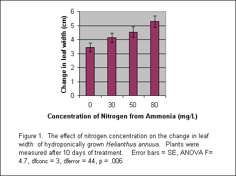
This sample figure is based on data collected by Marissa Vigilante '03' and Emily Nishioka '05'
Making Figures with Excel