|
|
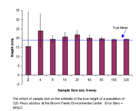
Examine the figure. Superimposed on the histograms, you'll note the vertical error bars. These represent the range in height over which the true mean of the population would be expected to lie 95% of the time. Note how the size of the error bars gets smaller as the sample size increases. This means that large samples more accurately represent the "true" mean of the population When means are presented in figures or tables, they should always be presented +/- some measure of error along with the sample size. continue |