|
|
| Authors present their experimental data in the results section.
Often, these data appear in the form of graphs and tables. Careful
scrutiny of the actual experimental data is vital to successfully
and critically analyzing a scientific paper. Thus, when reading
a scientific paper, you should pay close attention to its graphs and
tables. To maintain a critical stance, you may want to examine the
graphs first and then read the text of the results section to see
how the authors interpret their data. At the very least, you will
want to verify any important claims the authors make by examining
their graphs and tables. |
|
Reading a graph requires organization and attention to detail.
For a successful critique of the data, you should examine both graphs
and figure legends. Figure legends are blocks of text that are usually
located below the graph they describe. Sometimes data presented
in a graph can be clarified by referring to the text of a paper
(especially the methods section.)
Let's consider the graph below. (Note: The data for this graph
was created to illustrate graph-reading strategies. The graph does
not necessarily demonstrate the actual heart rate responses of men
and women.)
|
|
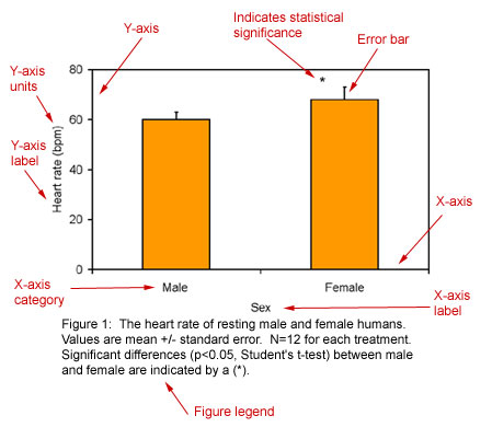
Tips on how to read a graph.
- To understand Figure 1, first examine its X and Y axes (see
above). The dependent variable (the measured variable)
is plotted on the Y-axis. The independent variable is plotted
on the X-axis. The independent variable may be a category or attribute
(i.e. sex or species) or it may be an experimentally manipulated
factor (i.e. time or exercise intensity).
- Pay careful attention to the units of measurement. 60
beats per minute (bpm) is very different than 60 beats per second
(bps).
- Look for indicators of experimental variability. These
are typically found as error bars on a figure and they are explained
in the figure legend. In the example above, the error bars represent
a measure of variability called the standard error. The figure
legend reports this: Values are mean +/- standard error.
- Determine the number of individual measurements
that were made. In the graph above, the heart rates of 12 men
and 12 women were studied. This is indicated by the statement:
N=12 for each treatment.
- Look for indications of statistical significance. In
the above graph, the asterisk over the female bar indicates that
female heart rates differ significantly from male heart rates.
The statistical tests used to determine significance (in this
case, a Student's t-test) are always identified in a graph's
figure legend. The statement p<0.05 means that there is less
than a 5% probability that an indicated difference is due to chance.
|
|
EXAMPLE 1 - Interpreting Figure 1.
Now, we are ready to actually interpret a graph. Let's look at Figure
1 (above). Take a moment to read it. Answer the following questions
and then check your answers.
Questions:
- What is the average resting heart rate for humans?
- How do the heart rates of men and women differ?
- How much variability is there in heart rate?
Answers:
- Between 60 and 70 bpm.
- Women have slightly higher heart rates than men; this difference
is statistically significant.
- There is some variability in resting heart rate among individuals;
the variability is somewhat higher in women than in men.
Click here to continue
|
|